

DIGITAL DESIGN
- Client: Cranberry (2025) | Role: UI/UX Designer
- Project: "Our History" Page Redesign
- Focus: Responsive web design, visual storytelling, brand integration
about the project
Cranberry's "Our History" page needed to honor 35 years of legacy while aligning with the 2025 rebrand. The original layout lacked hierarchy, didn't reflect the new brand direction, and struggled on mobile.
I redesigned the page in Figma, creating a modular timeline structure that improved storytelling flow and worked seamlessly across devices. The challenge was balancing respect for heritage with modern browsing behavior and responsive design requirements.
Research included internal feedback highlighting dense copy and unclear narrative, plus competitive analysis of Aurelia and Ansell's history pages to understand how medical brands connect legacy to innovation through modular layouts.
DESIGN
PROCESS
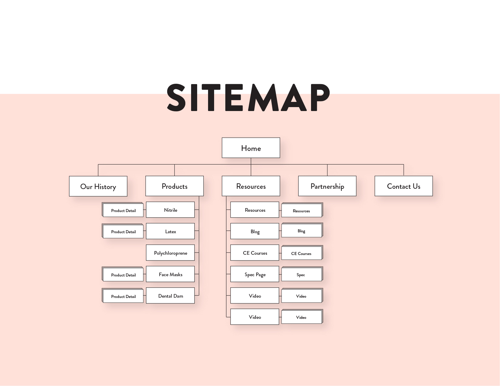
Sitemap:
Mapped page structure showing how "Our History" fits within Products, Resources, and Partnerships navigation. This established intuitive hierarchy and informed content organization for both product researchers and professional partners.
Mapped page structure showing how "Our History" fits within Products, Resources, and Partnerships navigation. This established intuitive hierarchy and informed content organization for both product researchers and professional partners.
DESIGN
PROCESS
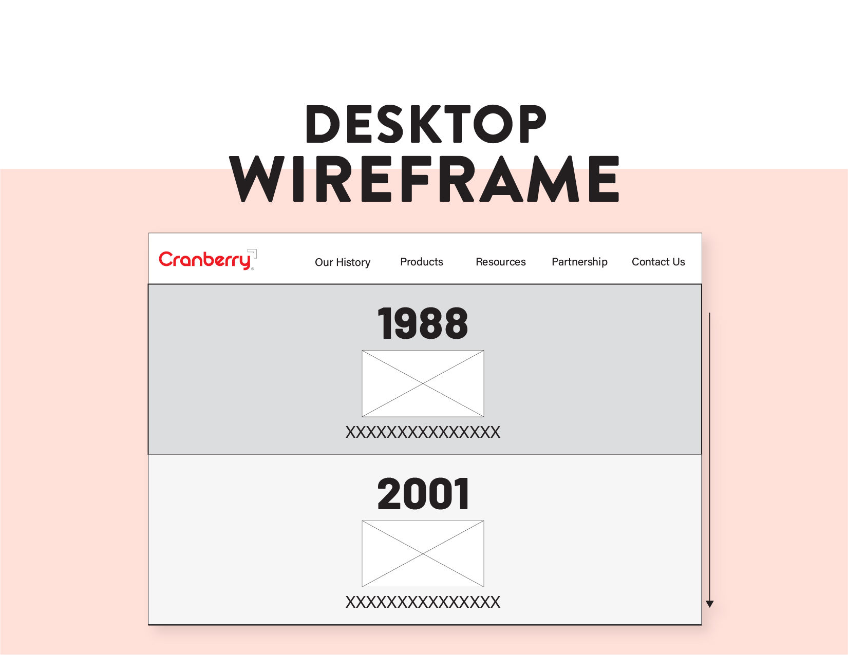
Desktop Wireframe:
Outlined content flow and visual hierarchy before adding design elements. Focused on clean spacing, digestible sections, and modular milestones that guide users through Cranberry's story. Alternating background tones visually separate sections while maintaining scannability on larger screens.
Outlined content flow and visual hierarchy before adding design elements. Focused on clean spacing, digestible sections, and modular milestones that guide users through Cranberry's story. Alternating background tones visually separate sections while maintaining scannability on larger screens.
DESIGN
PROCESS
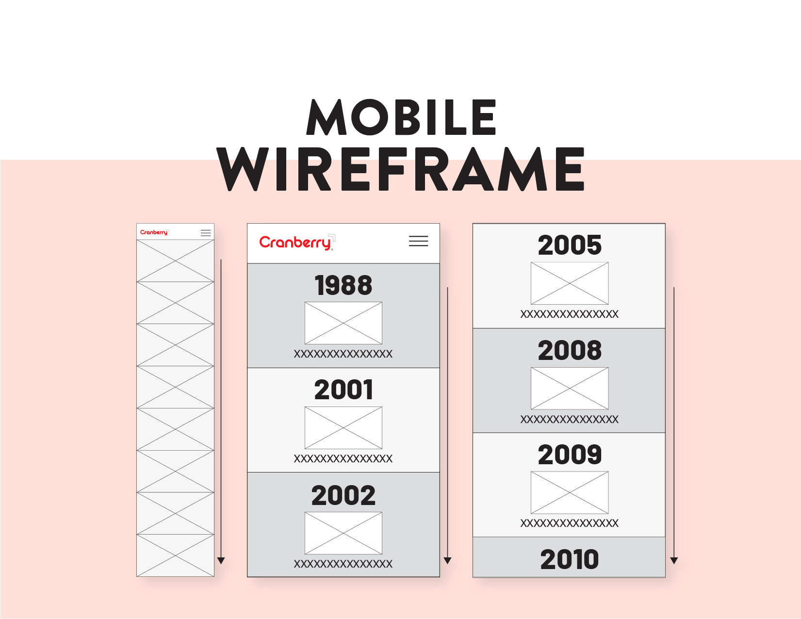
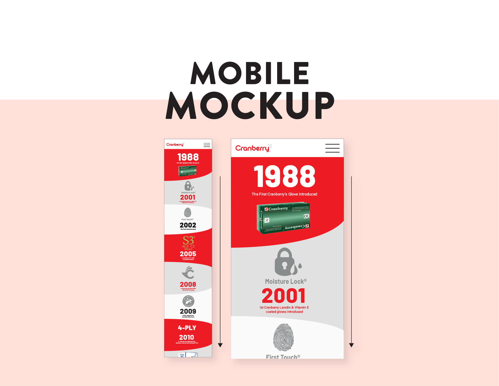
Mobile Wireframe:
Adapted the desktop structure for smaller screens with touch-friendly spacing, readable typography, and clear vertical flow. Prioritized persistent header navigation and content stacking optimized for mobile-first readability.
Adapted the desktop structure for smaller screens with touch-friendly spacing, readable typography, and clear vertical flow. Prioritized persistent header navigation and content stacking optimized for mobile-first readability.
DESIGN
PROCESS
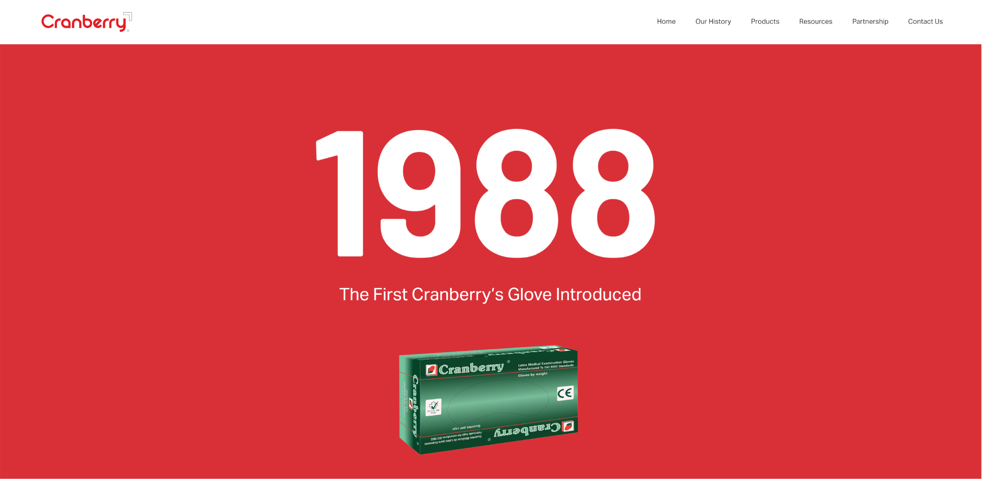
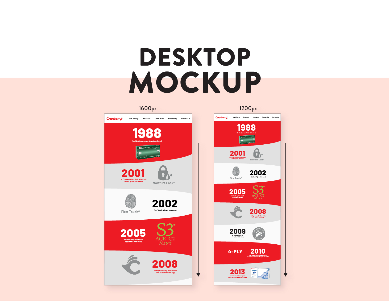
High-Fidelity Mockup:
Applied Cranberry's 2025 visual system with bold red and gray brand blocks anchoring the timeline. Integrated icons and product imagery to create visual rhythm and break up text sections. Design scales across breakpoints (1600px, 1200px, mobile) while maintaining hierarchy and engagement.
Applied Cranberry's 2025 visual system with bold red and gray brand blocks anchoring the timeline. Integrated icons and product imagery to create visual rhythm and break up text sections. Design scales across breakpoints (1600px, 1200px, mobile) while maintaining hierarchy and engagement.
DESIGN
PROCESS
Responsive Design:
Built layouts maintaining consistency across all breakpoints. Timeline modules preserve brand visuals, prioritize key content (year, product image, milestone summary), and ensure strong readability regardless of device.
Built layouts maintaining consistency across all breakpoints. Timeline modules preserve brand visuals, prioritize key content (year, product image, milestone summary), and ensure strong readability regardless of device.
Before &
After
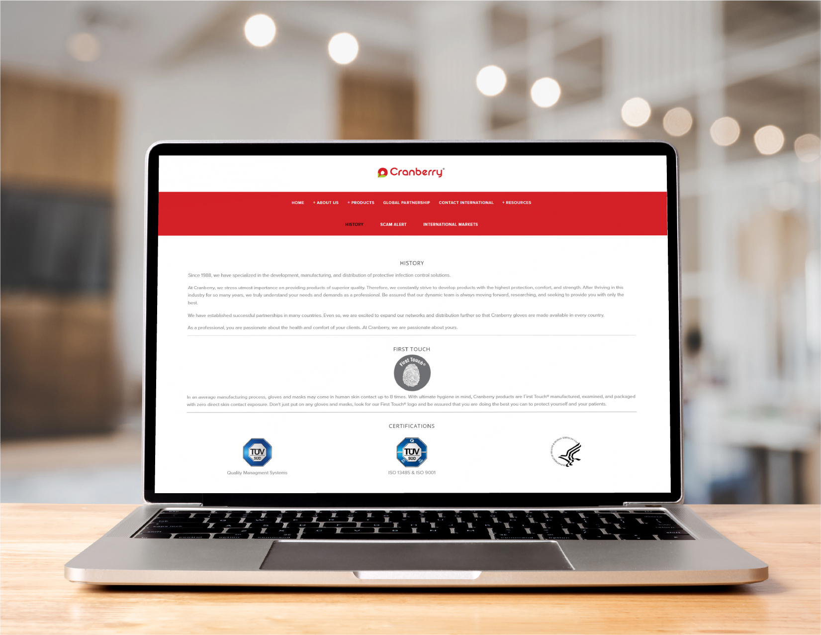
Original:
Long text blocks, inconsistent structure between sections, limited visual pacing. No clear hierarchy or engagement strategy.
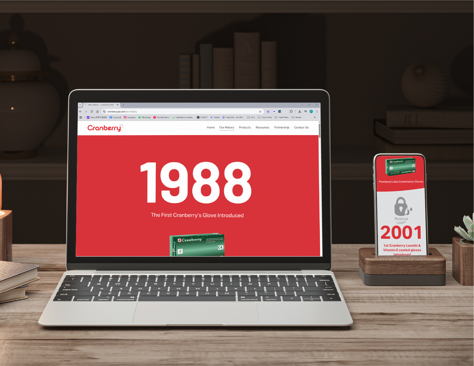
Redesigned:
Unified experience with consistent typography, color, and iconography. Cohesive brand narrative improving both readability and engagement.
Long text blocks, inconsistent structure between sections, limited visual pacing. No clear hierarchy or engagement strategy.
Redesigned:
Unified experience with consistent typography, color, and iconography. Cohesive brand narrative improving both readability and engagement.
Results:
- 25% increase in average time on page
- 20% reduction in bounce rate
- Positive internal feedback from marketing leadership
link to live page: www.cranberryusa.com/our-history