

Cranberry 2.0
- Client: Cranberry (2025) | Role: Lead Brand Designer
- Scope: Managed 220+ SKUs across brand development and packaging
- Production: International vendor coordination (China, Malaysia, Indonesia)
about the
project
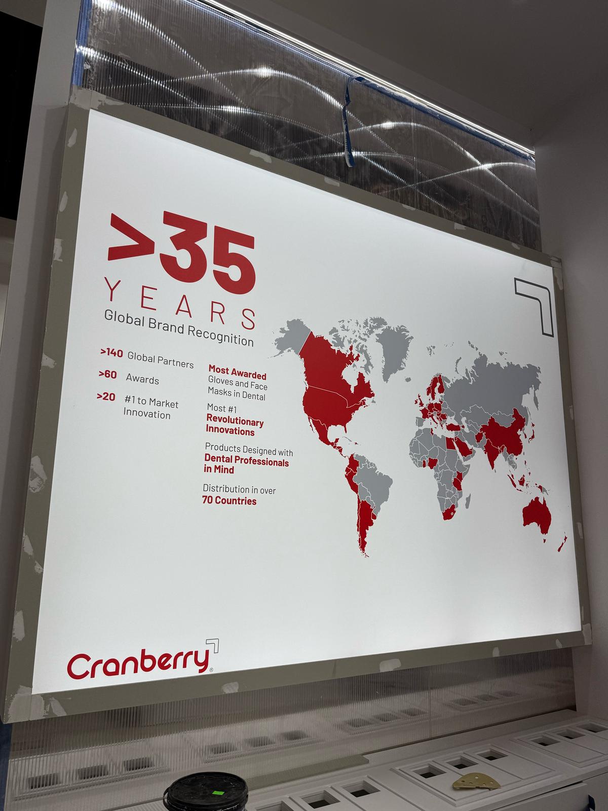
In 2025, Cranberry needed to evolve from trusted to definitive. The brief: transform a legacy infection control brand into the category specialist while maintaining global consistency across 220+ SKUs in 70+ countries with varying regulatory requirements.
I led the visual transformation, creating a design system built on what we called "The Specialist's Edge" - a philosophy of surgical precision, technical confidence, and zero excess. The work balanced creative ambition with production reality, coordinating between US and Malaysia teams with manufacturing across China, Malaysia, and Indonesia.
The challenge wasn't just making things look better. It was building a system that could scale across packaging, digital, print, and experiential touchpoints while maintaining the exacting standards medical professionals expect.
BRAND
IDENTITY
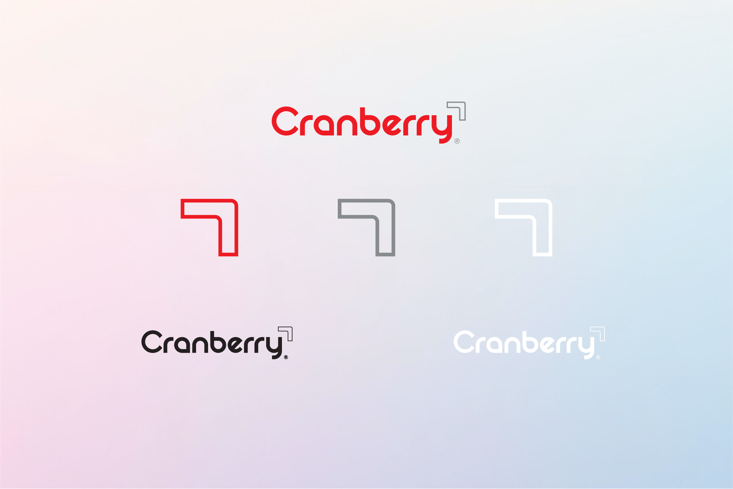
The logo system reflects precision without coldness. Barlow's rounded edges balance approachability with professionalism, while the Edge Icon functions as both a signature mark and a symbol of focused expertise.
The system needed to work everywhere, from tiny label lockups to 20-foot booth graphics, which meant testing scalability obsessively and building flexibility into every application.
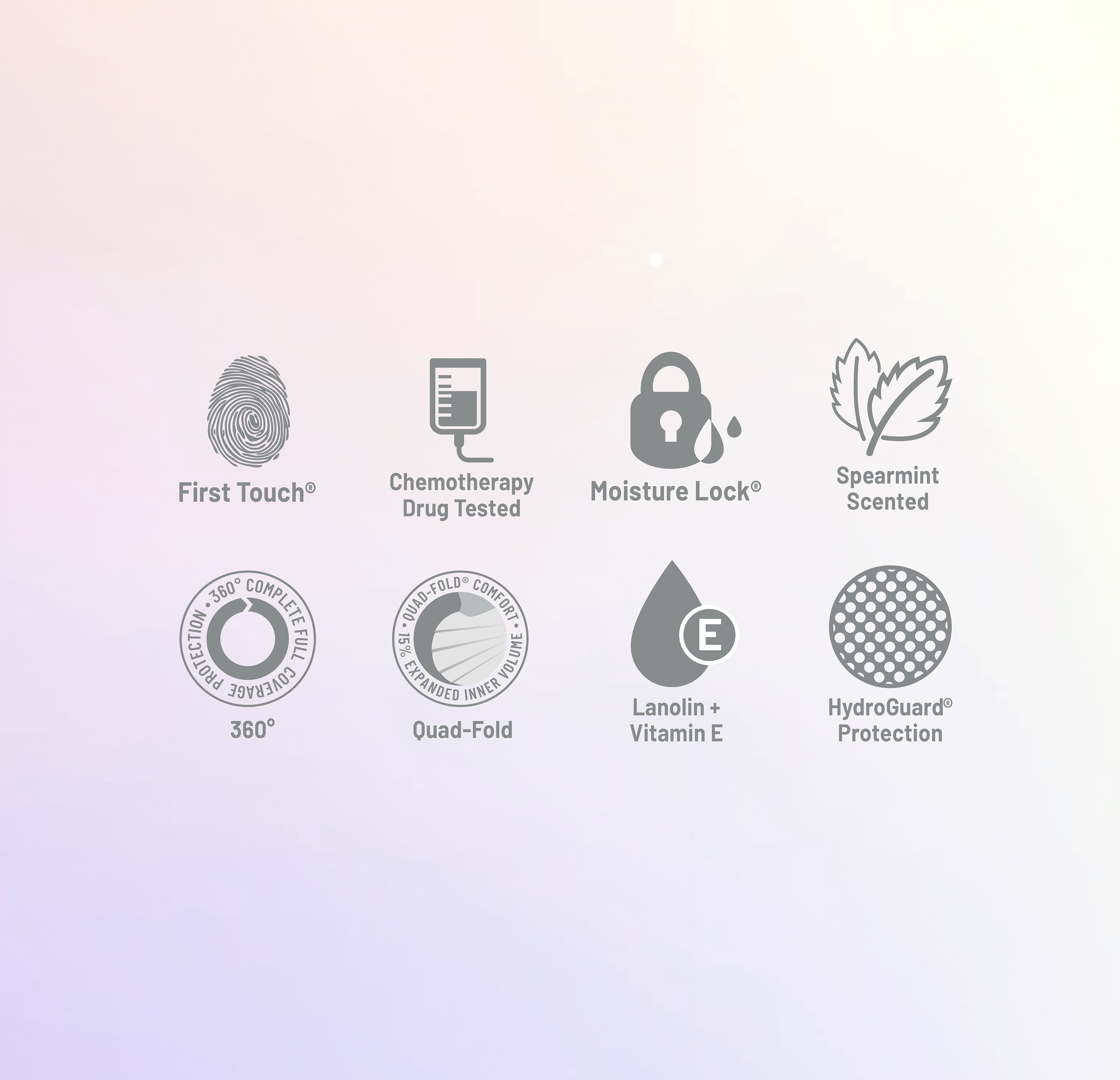
Brand Icons:
Redesigned the complete product feature icon library to maintain consistency across the packaging system while improving legibility at small sizes. Examples include First Touch, Moisture Lock, 360° Protection, and Chemo Tested.
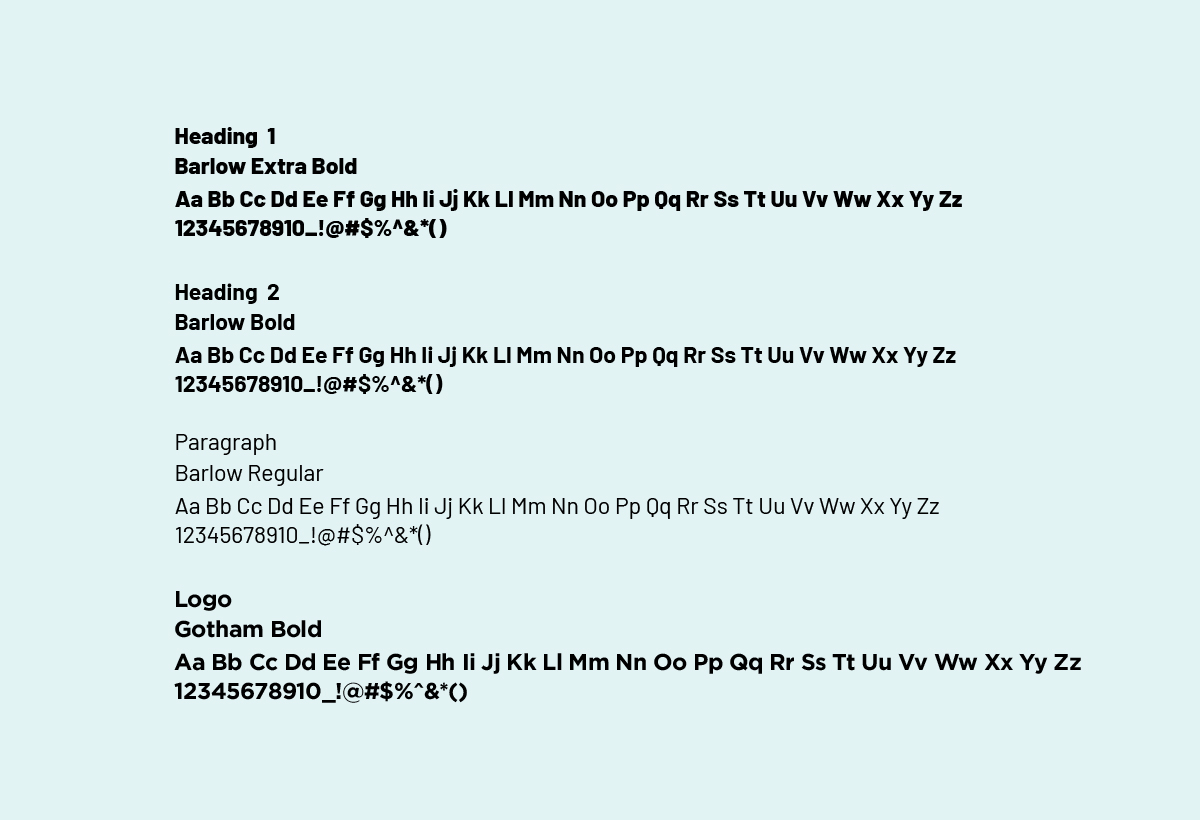
Typography:
Barlow for body and headlines,
Gotham for selective accents and logo pairings.
The system needed to work everywhere, from tiny label lockups to 20-foot booth graphics, which meant testing scalability obsessively and building flexibility into every application.
Brand Icons:
Redesigned the complete product feature icon library to maintain consistency across the packaging system while improving legibility at small sizes. Examples include First Touch, Moisture Lock, 360° Protection, and Chemo Tested.
Typography:
Barlow for body and headlines,
Gotham for selective accents and logo pairings.
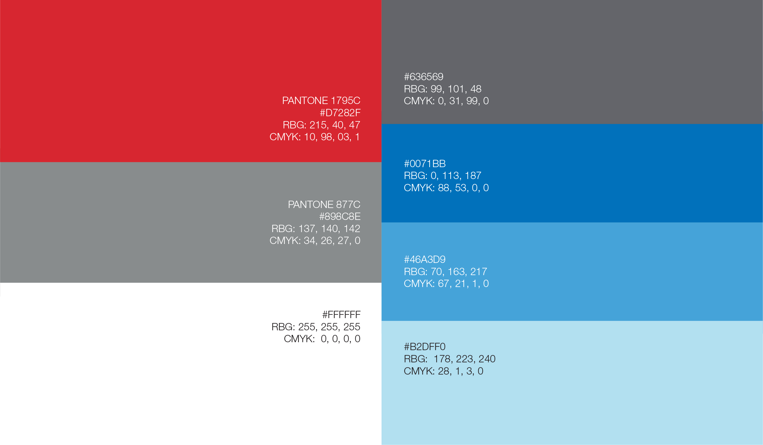
COLOR
PALETTE
- Primary colors:
Color choices were strategic, not decorative. Signature Red stays bold and recognizable. Luxurious Silver was the critical addition, shifting perception from "reliable medical supplier" to "premium specialist."
Surgical White is functional, not aesthetic. In medical environments, defects and contaminants must be instantly visible under any lighting. White isn't a design choice, it's a safety requirement.
Secondary colors:
Royal Blue, Sky Blue, Baby Blue, and Medium Grey provide flexibility without diluting the core identity.


Brand
Guidelines
- A rebrand only works if everyone executes it the same way. With teams spread across the US and Southeast Asia, plus production partners in China, Malaysia, and Indonesia, consistency wasn't optional.
I developed a comprehensive corporate communications guideline covering logo usage rules and restrictions, clear space and minimum size requirements, typography hierarchy, color specifications across print and digital, photography direction, tone of voice, and application templates for everything from business cards and letterheads to envelopes and print advertising. The document serves as the single source of truth for anyone touching the Cranberry brand, whether they're a designer in the US or a print vendor overseas.
The goal wasn't just "don't use the logo wrong." It was giving every team enough structure to stay on-brand while still having flexibility to adapt for their specific market or application.
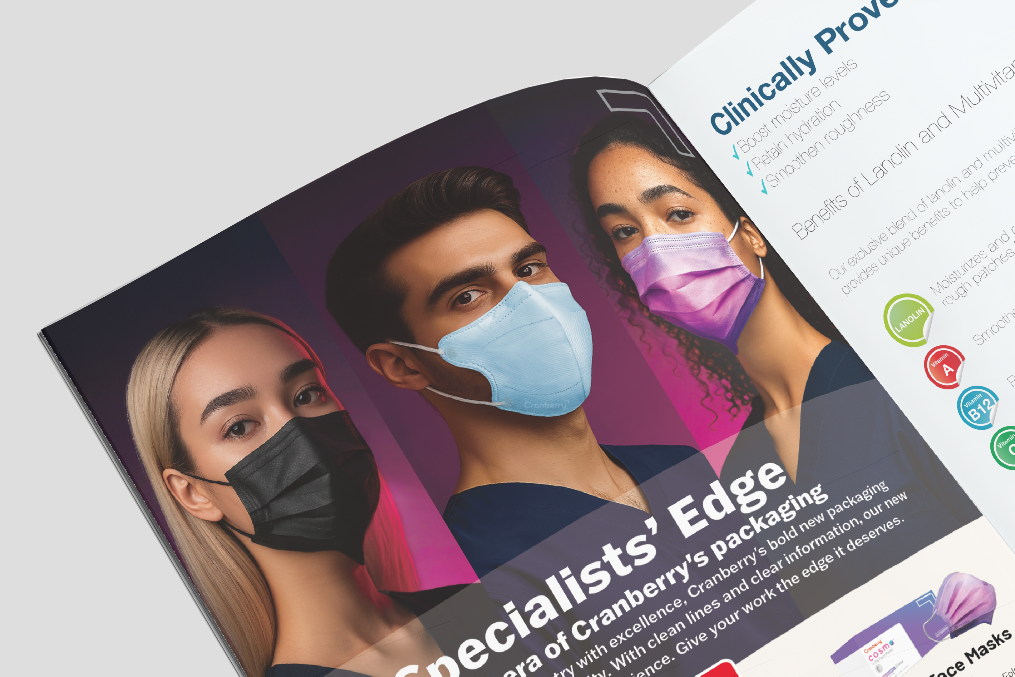
MARKETING
COLLATERAL
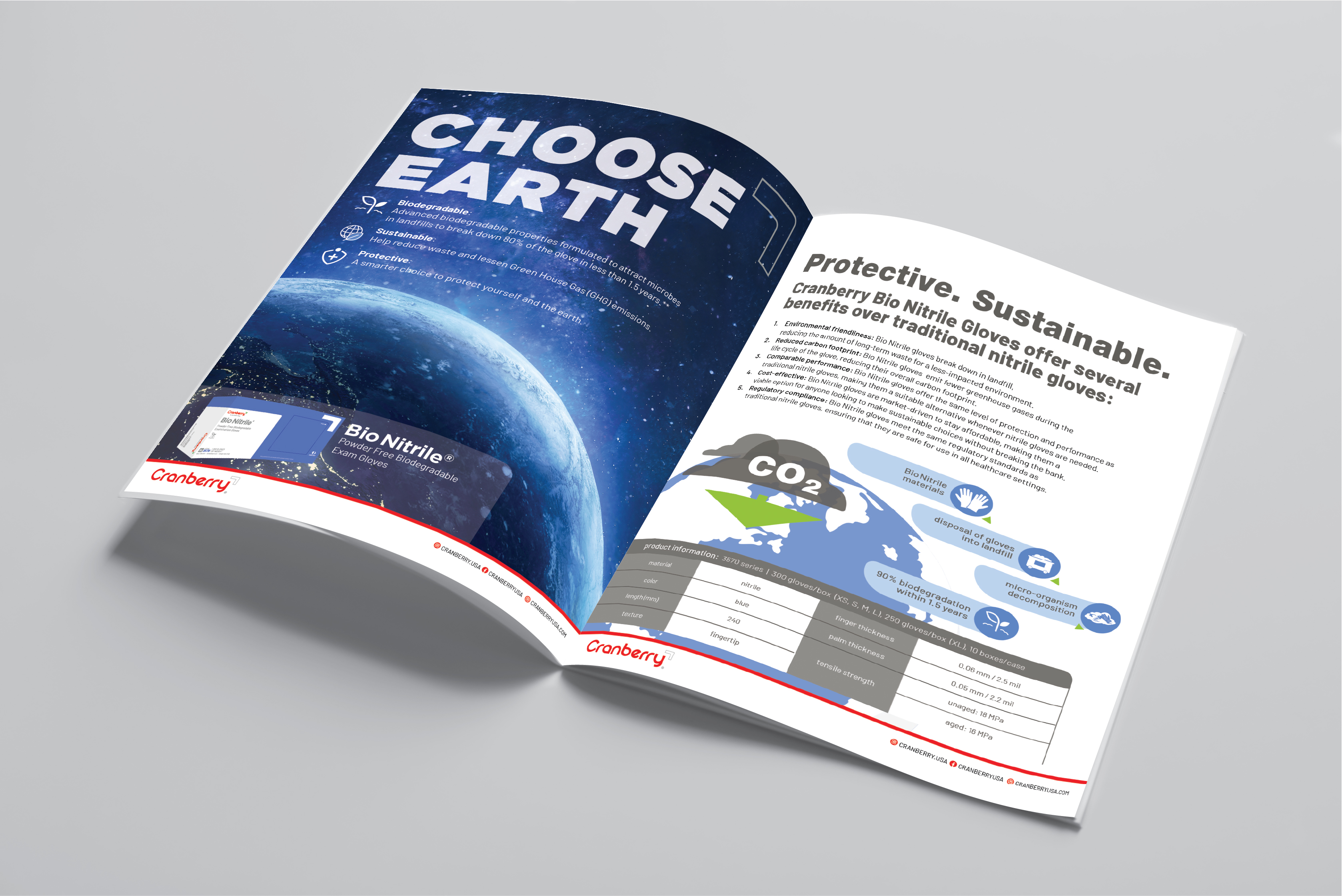
BioNitrile Magazine Article:
Sustainability messaging in medical markets requires credibility. The challenge was translating complex biodegradation science into something both digestible and urgent. Clean typographic hierarchy and earth-toned infographics made microbial decomposition tangible instead of abstract.
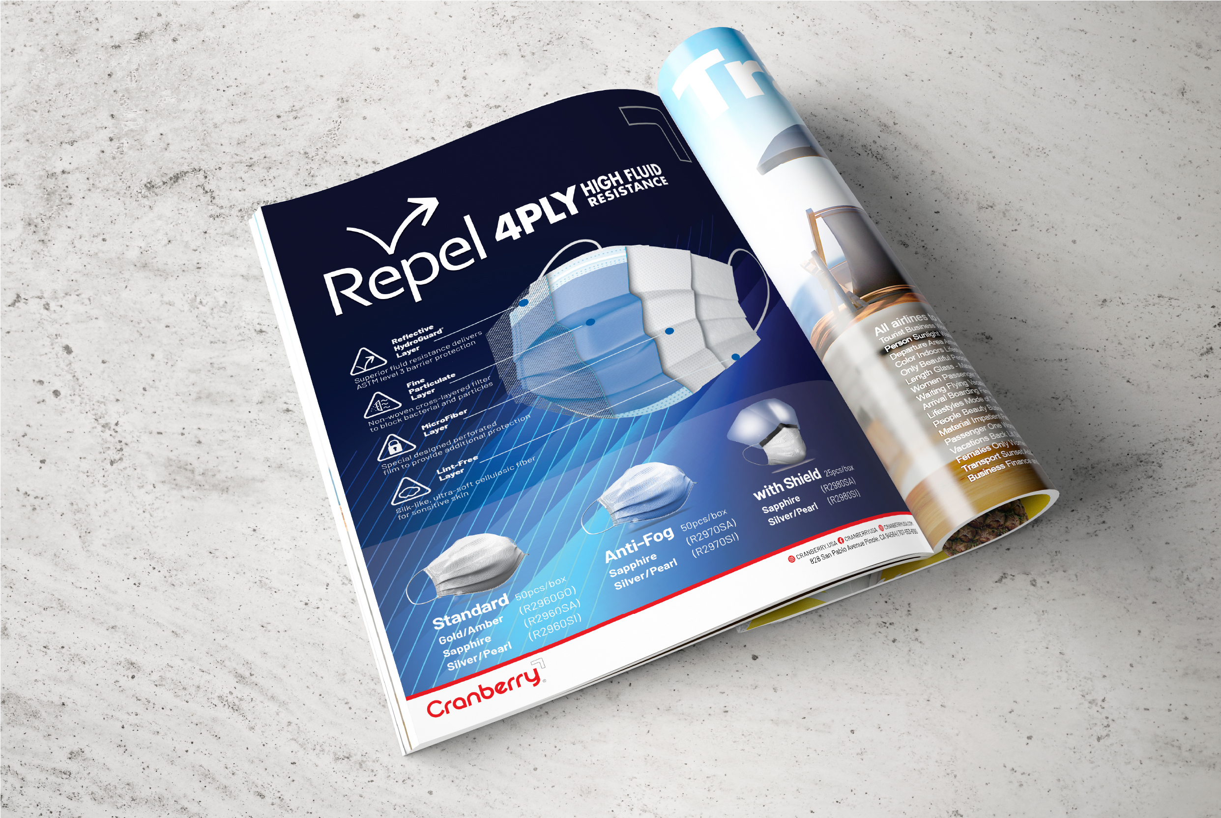
Repel 4-PLY Advertisement:
Face mask marketing lives or dies on trust signals. The layered breakdown educates without overwhelming, using blue to reinforce medical credibility and structured hierarchy to make scanning effortless.
Sustainability messaging in medical markets requires credibility. The challenge was translating complex biodegradation science into something both digestible and urgent. Clean typographic hierarchy and earth-toned infographics made microbial decomposition tangible instead of abstract.
Repel 4-PLY Advertisement:
Face mask marketing lives or dies on trust signals. The layered breakdown educates without overwhelming, using blue to reinforce medical credibility and structured hierarchy to make scanning effortless.
(AI-Enhanced Project)
Ad Campaign
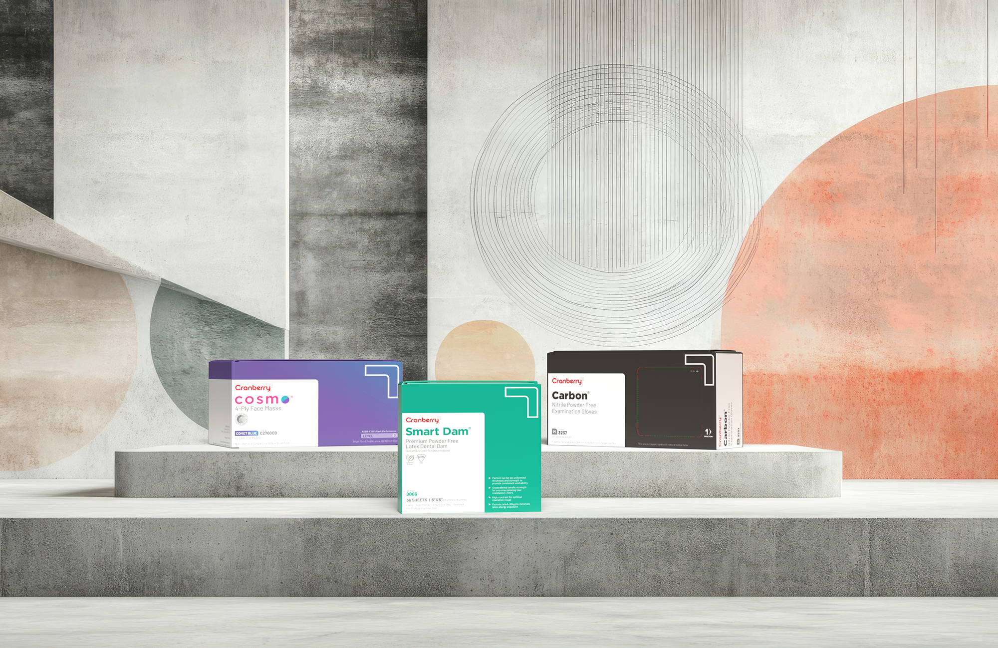
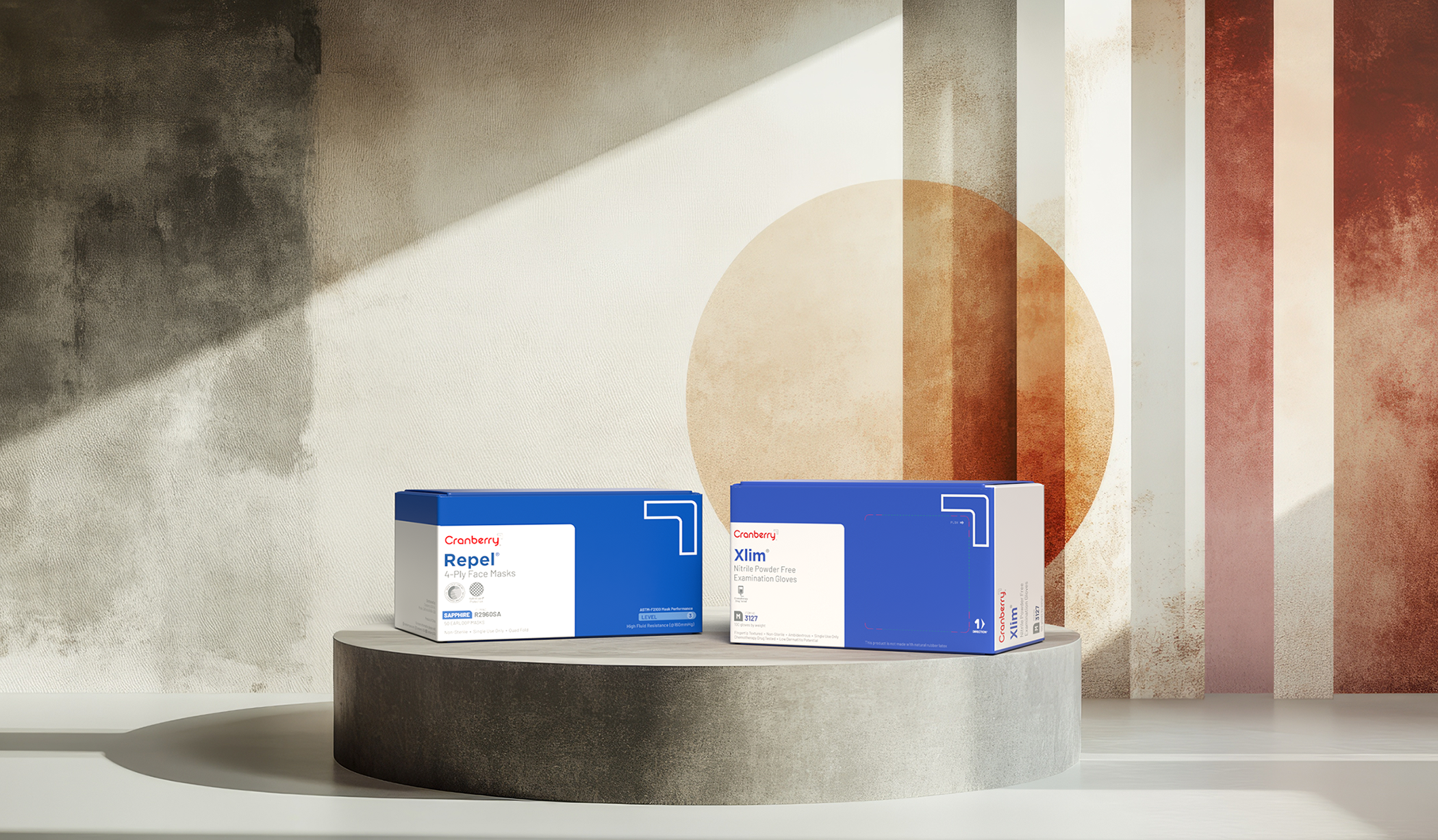
PACKAGING
DESIGN
The packaging system needed to work across inner and outer cartons, single-unit boxes, labels, sample packs, multi-part kits, and point-of-sale displays. Every SKU shares the same visual DNA but remains differentiated enough for quick identification.
Edge-inspired finishes (tested silver foils and coatings) add tactile dimensionality. Clean lines and bold red accents create shelf presence. Information hierarchy ensures customers find what they need without hunting.
This wasn't about making pretty boxes. It was about building a system that production teams could execute flawlessly across vendors and that end users could navigate instinctively.
View the Production Systems case study →
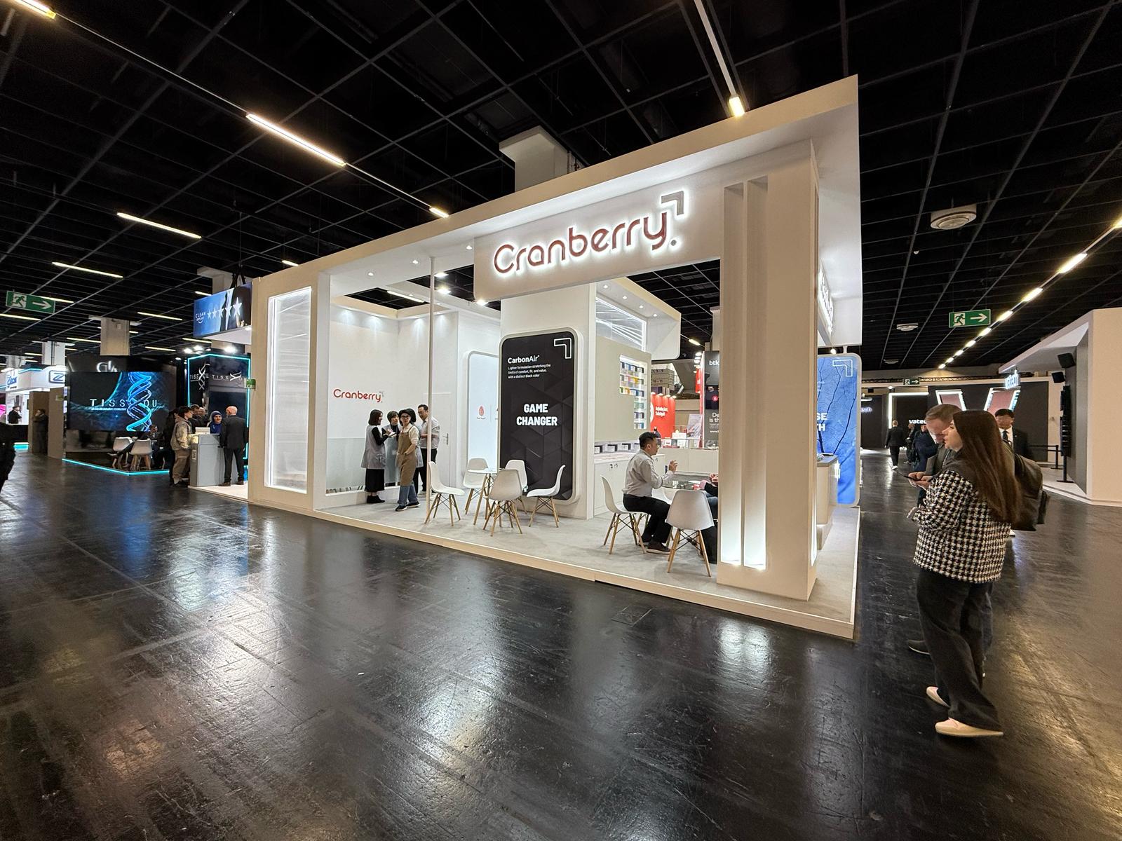
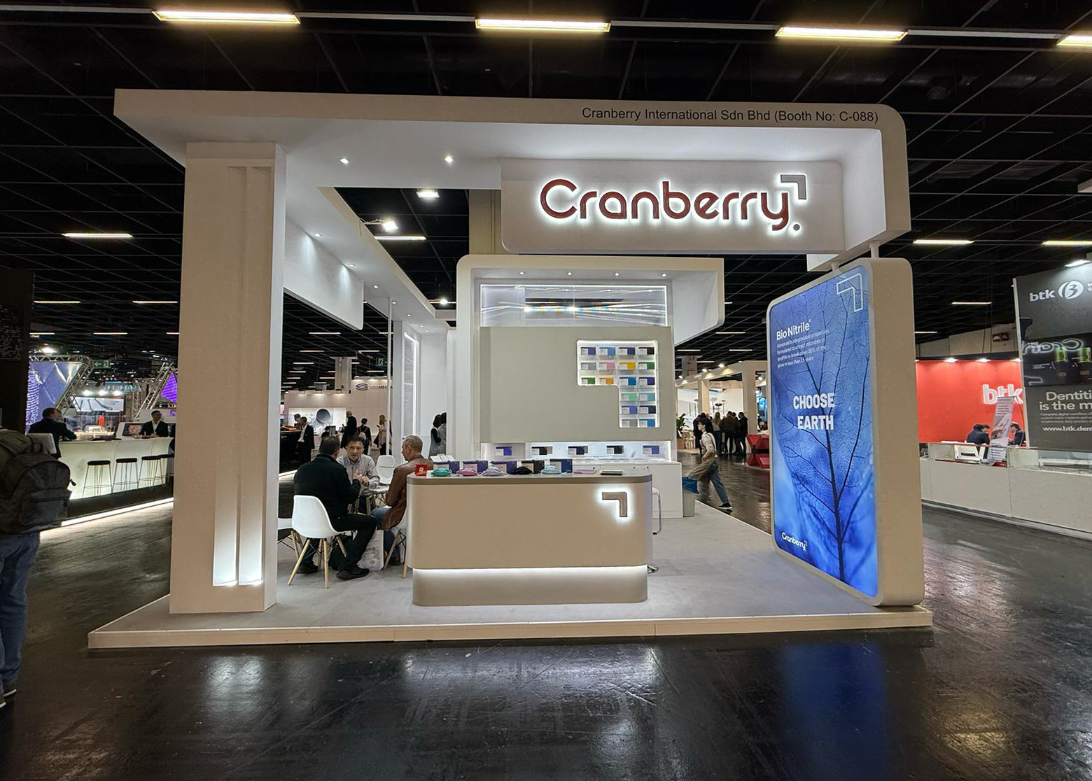
BOOTH
GRAPHIC
DESIGN
Cranberry's presence at IDS 2025 (International Dental Show, the world's largest dental trade show) marks the first full deployment of the rebrand in a high-stakes environment.
The booth design uses open layouts, minimalist structures, and strategic red accents for immediate recognition. Messaging focuses on precision and innovation rather than generic claims. The goal was creating an experience that feels premium and confident, not just informative.
The booth design uses open layouts, minimalist structures, and strategic red accents for immediate recognition. Messaging focuses on precision and innovation rather than generic claims. The goal was creating an experience that feels premium and confident, not just informative.
.jpeg)